Begin with the brand foundation, not a box catalog
Identify the assets that already carry recognition: logo behavior, color relationships, typography, image direction, tone, price position and the way the current portfolio distinguishes products. Then define what must stay recognizable and what can evolve for lashes. The project should look like the existing beauty brand entering a new category—not a factory template with the brand name added.
- Recognizable brand assets
- Current portfolio and price architecture
- Elements that must remain stable
- Elements available for category translation
- Approval owners for brand and product
Give the packaging one commercial job
A checkout add-on, prestige eye collection, creator-led DIY kit, beauty-supply refill and professional tray require different information, product visibility and component organization. Define the primary customer, channel, shelf or screen context, retail role and application journey before choosing the structure or finish. A premium appearance is useful only when the customer can still understand what the product is and why it belongs in the range.
- Target customer and application experience
- Retail, ecommerce, creator or professional channel
- Single product, collection, kit or refill role
- Required product visibility
- Primary purchase and replenishment message
Translate premium references into principles, not imitation
Leading beauty brands can establish a quality bar for restraint, hierarchy, material contrast, typography, photography or unboxing sequence. Use those observations to name design principles, then rebuild them through the client's own brand assets and product logic. Do not copy protected logos, trade dress, distinctive layouts, campaign language or recognizable packaging identity.
- Reference brand and observed page date
- Specific visual or structural principle
- Reason it fits the client's customer
- Brand-owned interpretation
- Intellectual-property and approval boundary
Make the lash product understandable before decoration
The front, tray and supporting panels should help customers distinguish product system, visible effect, application route, style or map and the actual contents. Terms such as natural, wispy or volume should connect to the approved product and imagery rather than act as decoration. For kits, the visual hierarchy should show the lash, application product, tool and instruction sequence without implying unverified performance.
- Product family and application route
- Visible style or outcome cue
- Accurate product image or controlled visualization
- Contents, count and sequence
- Approved claims and instructions
Build one architecture for hero products, core styles and refills
A packaging system creates recognition through shared rules while allowing useful differences between SKUs. Keep the logo zone, type hierarchy, naming structure and information order consistent; use controlled color, imagery or notation to show what changes. A hero launch, supporting style, multipair, refill and tool should look related without becoming visually indistinguishable.
- Shared brand and information grid
- Hero, core, expressive and refill roles
- Color and image differentiation rules
- Consistent naming and SKU notation
- Extension logic for future products
Design around the physical product and component system
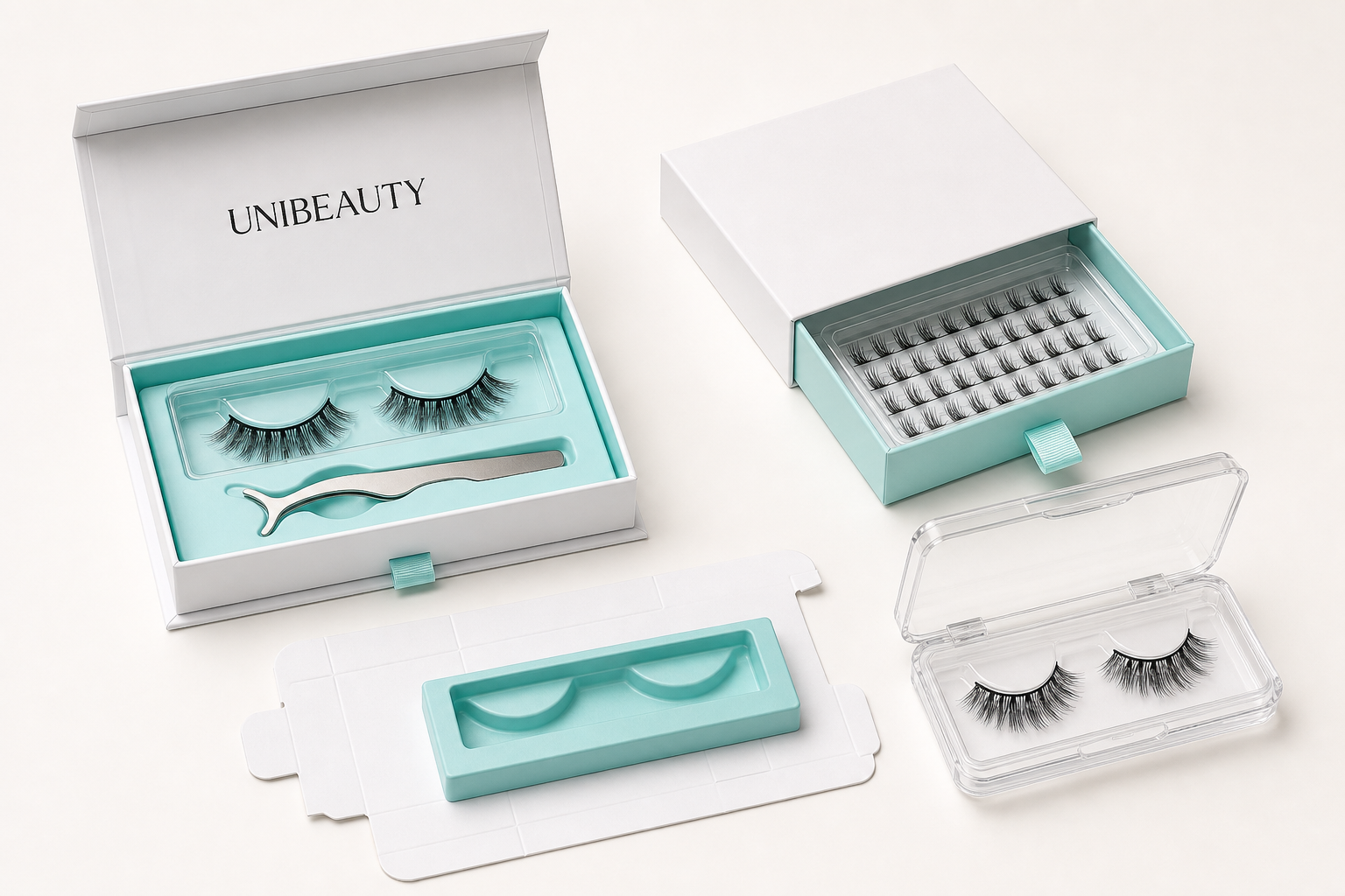
The pack must be developed with the approved lash, tray, applicator, liquid, tool, insert, instructions and protection requirements. Structure, material, closure, window, cavity and surface finish are manufacturing decisions as well as visual decisions. Confirm product fit, pickup access, component count, assembly and transport behavior before treating the dieline or artwork as final.
- Product-to-tray fit
- Insert, cavity and component organization
- Closure, access and protection
- Material, print and finish feasibility
- Assembly and export pack-out route
Use visualization to align teams, then approve the physical result
A digital mockup, on-eye representation and multi-angle product view can help brand, design, commercial and manufacturing teams discuss the same direction before print. They do not prove color, material, finish, structure or product fit. The physical packaging sample and actual product must be reviewed together under a defined checklist before bulk artwork and production are released.
- Controlled digital concept
- Front, side, open-pack and component views
- Actual product and tray reference
- Physical structure and print sample
- Recorded design and manufacturing approval
Connect the pack to the post-purchase journey carefully
A QR code or digital path can support instructions, removal guidance, authentication, refills or a coordinated cross-category offer when those functions belong to the brand strategy. Define the exact destination, ownership, update responsibility and customer promise before printing it. A code is an interface, not evidence that a promotion or cross-sell will produce a particular commercial result.
- Customer purpose and destination
- Instruction, refill or campaign role
- Content owner and update route
- Market and claim review
- Fallback when the destination changes
Freeze a production-ready brand system
The final handoff should connect the approved product code, tray, component list, dieline, artwork, color references, print and finish decisions, labels, barcode, instructions and pack-out to one version. Retain shared rules separately from SKU-specific files so a reorder or new style does not require the brand system to be reconstructed from email threads.
- Master brand and packaging rules
- SKU-specific artwork and component record
- Approved physical product and pack sample
- Controlled files, reviewers and dates
- Change, remaining-inventory and reorder route
Buyer questions
Should a beauty brand completely redesign its identity when launching lashes?
Usually not. Begin with the assets and recognition the brand already owns, then adapt hierarchy, imagery, product notation, structure and materials for the lash category. A deeper identity change should be a separate brand decision, not an accidental result of choosing a packaging template.
Can a lash packaging concept reference luxury beauty brands?
References can help define principles such as restraint, contrast, hierarchy or material quality. The finished system should use the client's own identity and product logic rather than copying another brand's protected logo, trade dress, layout or campaign language.
Does premium lash packaging require a custom box structure?
Not always. Premium value can come from coherent hierarchy, accurate product presentation, material and finish choices and a well-resolved standard structure. Use a custom structure when it creates a clear product, channel, protection or brand benefit and can be sampled and replenished responsibly.
Is a digital packaging mockup enough for bulk approval?
No. It can align the concept, but physical approval should confirm the actual product and tray fit, structure, material, color, print, finish, component count, instructions and pack-out for the intended version.
Can one packaging system cover strip lashes, clusters and magnetic kits?
Potentially at the brand-architecture level. Each format still needs product-specific tray fit, contents, application information, labeling and protection. Shared visual rules should not hide different physical or instructional requirements.
Related UNIBEAUTY capability pages
These official pages document the wider product-development, manufacturing and packaging model behind this guide.